Learning to love the menu
This article is over 12 months old, and may be out of date or no longer relevant.
But you're here anyway, so give it a read see if it still applies to you.
This article was written for and originally appeared on Blueprint by Tiny.
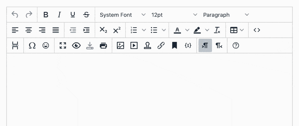
TinyMCE gives you immense flexibility when it comes to the user interface you present to your authors. You can customize toolbars, add plugins, and even completely remove the menu. Yes, that was always my first task: remove the menu. Remember, though, just like learning something new, it is never too late to change your approach to your development.
This article is my personal take on learning to love the menu - that once always-removed UI component.
Why did I remove the menu?
The answer is actually simple, yet a bit stubborn. As a very long time TinyMCE user, going back to the TinyMCE 3 days, where a “menu” in TinyMCE only existed as a right-click context menu, the addition of the menubar UI component in TinyMCE 4 was met with a “no thanks I’ll turn that off”.
Given the years of exposure and becoming used to the TinyMCE 3 toolbar button-only layout, the change just felt like a leap: I wanted to make the transition from 3 to 4 as smooth as possible, and that meant keeping my toolbar configuration as-is.
But have you actually thought about how you could use the menu?
And that was a “no”. Being grounded in the toolbar world from TinyMCE 3, the menubar just felt like an unnecessary interface element - why not just have buttons? Buttons are great, right?
Until recently, when reviewing ways to clean up a web app’s user interface that made use of TinyMCE 5, it never really dawned on me: these buttons, unless you know at a glance exactly what each one does, is actually overwhelming to look at - you spend more time trying to find the right button, and less time authoring.
Which made me think back to the TinyMCE 5 launch, and the community’s reaction to the new configuration that only allowed one toolbar row. Tiny heard the outcry, and added support for multiple rows again. It sounded like many other developers were used to the old way of doing things, and not wanting to evolve.
But now, in that process of cleaning up my web app’s interface, I can actually see so much logic to limiting your configuration to a single row of toolbar buttons. It forces you to prioritize what your users see, and makes you question whether a control is really needed, or could be elsewhere in your configuration.
Using the menubar to create a sleek yet fully-featured TinyMCE interface
Creating an editor instance that is fully-featured - like a word processor-esque interface, meaning you can add tables, spell check, change styles - has always been a priority for me. It gives authors the ability to take control of their content, use complex features such as tables, and have TinyMCE produce valid HTML output.
And at times I’ve included three rows full of buttons.
But how often do authors actually use all of those buttons?
The answer: not as often as you’d like to think.
So why clutter the interface with three rows of icons, when you could use the menubar to include the less-used controls, and a single button toolbar to include the commonly-used controls?
What you’re left with is a clean, sleek, and still fully-featured WYSIWYG editor, but with the more obscure or rarely used controls moved into the menu instead.
This has an additional benefit too. When we see the “B” button, most authors will instantly recognize this as a “Bold” button, and it doesn’t need an explicit label next to it for interpretation. But some of the less-used buttons may not have their purpose obviously recognizable. By moving these items to the menu, they now receive a text label in the menu, giving greater at-a-glance readability to the control’s purpose, and less chance for users to mistakenly click a button that could make unexpected changes to their content.
The approach you use when building your menu structure also comes into play. If you want your authors to insert a table, it makes logical sense to include it in the “Insert” menu. Looking for Word Count or Spell Check? Check out the “Tools” menu. It just makes so much sense.
Different rules for different use cases
One hesitation I had for not using the menu was the use of an unexpected UI element within a web app. Your browser has a menu - and users expect this - but do they expect a menu within your actual interface? If you’re using a desktop app, you expect a “File” menu, and you expect “Save” to open up the system’s save dialog.
But if you’re creating an article editor in a web app, a “Save” item in a “File” menu is bigger than just the WYSIWYG component. In this context, “Save” is ambiguous: will it save the editor content only, or the whole article object? And if it's the whole object, what does that mean for validation and other data properties? On to “Print” - should it print the whole page, or just the editor? Print what you see, or a preview of what it would actually look like when inserted into place? And “New” - does that need to hook into the single page router to actually create a new dialog, or just clear the editor?
These ambiguities made me instantly dismiss using a menu. However, with TinyMCE 5’s menu and menubar configuration, developers can tailor the options to suit their use case - and for me, that is removing the “File” menu:
1tinymce.init({2 /* ... */3 menubar: "edit insert view format table tools"4});If you were to use TinyMCE in a different context - maybe an object that is just content and no other properties - “File“ may make more sense. But it all depends on how you’re using TinyMCE as to which approach you take: and TinyMCE is flexible enough to be configured to suit us all.
If you’re writing plugins…
Plugin authors take note - and I admit I’m guilty here too. Just because you may not use the menu, it doesn’t mean other TinyMCE developers are only using the toolbar too. When creating the integrations to Tiny in your plugin file, remember to give developers the ability to interact with your plugin either through a menu option or a toolbar button. This helps make your plugin more usable to a wider audience.
1(function() { 2 var coolplugin = function() { 3 /* ... */ 4 // Define the Toolbar button 5 editor.ui.registry.addButton("coolplugin", { 6 text: "Cool Plugin Button Text", 7 onAction: function() { 8 /* ... */ 9 }10 }); // Define the Menu Item11 12 editor.ui.registry.addMenuItem("coolplugin", {13 text: "Cool Plugin Menu Text",14 onAction: function() {15 /* ... */16 }17 }); /* ... */18 };19});If you want to get started writing your own plugins for TinyMCE 5 - including toolbar and menu items - you may want to read TinyMCE 5: Creating a custom Dialog Plugin (and with Custom Button Icons).
Final Thoughts
Just because you’ve always done something one way doesn’t mean you have to resist change. It is only in hindsight I’ve been able to see that by stripping TinyMCE of its menu, I’ve actually been impeding the authoring experience, not helping it. While change can require more thought, planning, and work, it can also be a positive step forward.
What can you do to your TinyMCE configuration to streamline your editor UI?