Creating a Bard addon for adding a class to inline content for Statamic 3
This article is over 12 months old, and may be out of date or no longer relevant.
But you're here anyway, so give it a read see if it still applies to you.
This was written for Statamic 3 - and there are some changes for Bard addons in Statamic 4.
Bard offers incredible flexibility – especially with Sets – when it comes to authoring content. And not just content, but varied layouts and structures while maintaining a code-free authoring experience.
But being able to add a class to selected content – inline or block - is just not possible.
And I get why it’s not a standard feature: everyone’s use case is different, and engineering something that adds classes to content while providing a perfect user experience in every use case is not really a possibility.
The good news: it’s not that hard to create an addon yourself that does exactly what you need it to do for your content authors.
This requires knowledge of Statamic, addons, composer, and willingness to explore a smidge of how ProseMirror works.
So… let’s get started!
What is Les Mills?
This is the first big question people want answered: what the heck is Les Mills?
In the context here, I’m referring to Les Mills group fitness classes, delivered in gyms, virtually and on-demand in thousands of clubs in hundreds of countries. You may have even heard of BODYPUMP, the original barbell group fitness class, with up to 1,000 reps per class. Yep, a 1 with 3 zeros after it.
Why does it matter? Well I teach Les Mills group fitness classes – and have since 2007 – and am trained in 5 programs – BodyAttack, BodyBalance, BodyPump, Les Mills Core (formerly CXWORX) and Les Mills Tone. And for my site here, I needed to be able to highlight class names on the Les Mills page so I could colour them with their program brand colours. And this is how it all came about: I needed to write a Bard addon that would help me achieve this.
Fun fact too: Les Mills International, the company who produce the programs, is actually named after a real person too: gold medal-winning athlete Les Mills from New Zealand. LMI is run by Les Mills’ son, Phillip Mills.
Create your addon
Where you want to install your addon is up to you.
If you are writing an addon that is for a single project, then you could just store it with the project. If you’re wanting to reuse or distribute it, then you may want to store it outside of your project. That decision is up to you.
Simply run the please command:
1php please make:addon martyfriedel/les-mills-class-typesIf you’re keeping it in your project, that’s it. If you want to move it outside, I found the easiest thing to do is:
Firstly, remove it from your project’s composer:
1composer remove martyfriedel/les-mills-class-typesSecondly, move your code from the addons folder to wherever you want to store it.
And finally, update your composer.json file manually:
1{ 2 "require": { 3 ... 4 "martyfriedel/les-mills-class-types": "*", 5 }, 6 ... 7 "repositories": [ 8 { 9 "type": "path",10 "url": "path/to/addon"11 }12 ]13}And then run:
1composer updateThe most useful thing you can do though is set up a symlink to your build folder so you don’t need to keep publishing after every change:
1ln -s /path/to/addon/martyfriedel/les-mills-class-types/dist public/vendor/les-mills-class-typesWith this in place, every change you make to your build will be picked up by Statamic.
Refer to Statamic’s as-always-excellent documentation for full addon details.
The parts of your addon
Your Bard addon for Statamic includes:
dist
Contains your production-ready built coderesources
Your frontend source – including JavaScript and CSSsrc
Your PHP source – for getting your addon in to Statamic
Plus of course you’ll need your build files too – I’ll assume that you’re all set to manage this yourself, and know how your build process works.
Remember, if you need, you can refer to the source code for this addon for a full working version if you want to take a peek.
Setting up for Statamic
Inside your src folder, we need to do two things:
update the ServiceProvider to tell Statamic what our addon is made up of, and
add a new class that tells PHP how to handle and process our new Mark type
Inside the ServiceProvider, we need to tell Statamic about our JavaScript, CSS and additional fonts (for the icon for the toolbar), plus add our new Mark to the Augmentor so that it can be rendered.
Adding the assets is as easy as setting some paths:
1protected $scripts = [ 2 __DIR__.'/../dist/js/les-mills-class-types.js', 3]; 4 5protected $stylesheets = [ 6 __DIR__.'/../dist/css/les-mills-class-types.css' 7]; 8 9protected $publishables = [10 __DIR__.'/../dist/css/fonts' => 'css/fonts'11];And adding our Mark to the Augmentor is as simple as doing just that in the boot function:
1public function boot()2{3 parent::boot();4 Augmentor::addMark(LesMillsClassType::class);5}Obviously, we also need to create a new Mark. This is what tells the Statamic Augmentor how to process our new Mark type when it finds it in any of our Bard content blocks.
Let’s start simply by creating our Mark, and defining the type and tag:
1namespace MartyFriedel\LesMillsClassTypes;2 3use ProseMirrorToHtml\Marks\Mark;4 5class LesMillsClassType extends Mark6{7 protected $markType = 'lesMillsClassType';8 protected $tagName = 'span';9}The $markType is what we will use in our JavaScript files, and is what the mark appears as in your .md content files.
If you’ve looked at your content files before, you’ll notice things like “type: paragraph” – pretty obvious that this is a paragraph.
This means our addon will now make “type: lesMillsClassType” appear in our content files. When Statamic is processing our content, it will now know to look at our LesMillsClassType Mark type to be told how to render it.
We need to add two functions to our Mark – one that looks for matching the type, and the other for rendering it.
1namespace MartyFriedel\LesMillsClassTypes; 2 3use ProseMirrorToHtml\Marks\Mark; 4 5class LesMillsClassType extends Mark 6{ 7 protected $markType = 'lesMillsClassType'; 8 protected $tagName = 'span'; 9 10 public function matching(): bool11 {12 return $this->mark->type === $this->markType;13 }14 15 public function tag(): ?array16 {17 return [18 [19 'tag' => 'span',20 'attrs' => [21 'class' => 'les-mills-class '.$this->mark->attrs->key22 ],23 ],24 ];25 }26}Reading through these two examples should hopefully make sense.
For matching, we have a match when the mark’s type is equal to our $markType. Makes sense, right?
For tag, we want to return a tag – and all we want to do here is create a span, and set a class. For our needs, tag is returning an array that includes our definition.
The tag is a span, and we’re adding the “class” attribute of “les-mills-class [whatever_our_key_attribute_is]”.
And that’s it – the PHP and Statamic side of things is done. Hopefully nothing is here that is too complicated or confusing.
Setting up for Bard
Our frontend work is a little more detailed than the backend, and has a few more pieces.
We have a CSS file that is used to define our toolbar icon, plus the appearance of our <span> in the editor.
We have a fonts folder that uses includes the icon for the toolbar as a webfont.
And we have all the JavaScript.
The CSS
The easy stuff is the CSS and fonts. Refer to the source of the complete CSS file, and the webfont is just a font. The purpose of these files is to add the webfont for the toolbar button, and add styles that will style the content within the editor.
The only kooky part here is that your icon definition needs to follow the same naming convention that Statamic is expecting – and that is pre-fixed with an “fa-“. Given I wanted to use a custom icon, I made my own webfont for this purpose. So in the CSS you’ll see:
1.fa-les-mills {2 font-family: 'icomoon' !important;3 /* ... */4}5 6.fa-les-mills:before {7 content: "\e900";8}This is simply pointing to my font family, and defining the icon content. As a web developer, nothing too taxing, but just worth pointing out. I made my font in icomoon – but you can use whatever family you want.
The JavaScript
There are three main pieces for the JavasScript:
bard.js, the entry point to the JavaScript and defining the button,LesMillsClassTypes, defining the behaviour of the Mark itselfLesMillsClassTypesMenu, a Vue.js Single File Component that will appear when you click the button
Our bard.js is straightforward – there are two key actions taking place here. Firstly, extending Bard with our new Mark, and secondly, adding our Button.
Extending Bard is as simple as passing our new Mark (don’t worry, we’ll look at the Mark next):
1Statamic.$bard.extend(({mark}) => mark(new LesMillsClassTypes()));Adding the button has some more lines, but hopefully all is pretty self explanatory. We’re adding a new button, with a given Text (label), command, icon and component (our LesMillsClassTypesMenu)
1Statamic.$bard.buttons(() => { 2 return { 3 name: 'lesmillsclass', 4 text: 'Les Mills Class Type', 5 command: 'classType', 6 args: { 7 key: "" 8 }, 9 icon: 'les-mills',10 component: LesMillsClassTypesMenu11 };12});Putting it altogether, it’s a short and simple file:
1import LesMillsClassTypes from "./LesMillsClassTypes"; 2import LesMillsClassTypesMenu from "./LesMillsClassTypesMenu.vue"; 3 4Statamic.$bard.extend(({mark}) => mark(new LesMillsClassTypes())); 5Statamic.$bard.buttons(() => { 6 return { 7 name: 'lesmillsclass', 8 text: 'Les Mills Class Type', 9 command: 'classType',10 args: {11 key: ""12 },13 icon: 'les-mills',14 component: LesMillsClassTypesMenu15 };16});Let’s look at the Mark type first – our LesMillsClassTypes.js file.
This is defining how the Bard editor should handle our Mark. As a skeleton, we need a little bit of structure – and Statamic’s source tells us just that.
1return new class extends Mark { 2 get name() { 3 return extension.name(); 4 } 5 6 get schema() { 7 return extension.schema(); 8 } 9 10 commands(args) {11 return extension.commands({...args, updateMark, removeMark, toggleMark });12 }13 14 pasteRules(args) {15 return extension.pasteRules({...args, pasteRule});16 }17 18 get plugins() {19 return extension.plugins().map(plugin => new Plugin(plugin));20 }21}This becomes the skeleton structure for our Mark class:
1export default class LesMillsClassTypes { 2 name() { 3 return "lesMillsClassType"; 4 } 5 6 schema() { 7 // ... 8 } 9 10 commands({type, updateMark}) {11 // ...12 }13 14 pasteRules({type}) {15 return [];16 }17 18 plugins() {19 return [];20 }21}You can see here that we have defined our name – lesMillsClassType – which matches the $markType in our LesMillsClassType.php file.
Given this is about simply wrapping selected content with a span and a class, we won’t be using pasteRules or plugins.
Firstly, let’s build the schema. This describes:
the attributes we want to use
how to parse the DOM (and what to do with it)
how to output the Mark to the DOM
This is simply a standard object structure with attrs, parseDOM and toDOM:
1schema() { 2 return { 3 attrs: { 4 key: '', 5 }, 6 parseDOM: [ 7 { 8 tag: "span.les-mills-class", 9 getAttrs: (dom) => ({10 key: dom.getAttribute('data-class')11 })12 }13 ],14 toDOM: (mark) => [15 "span",16 {17 'class': 'les-mills-class ' + mark.attrs.key,18 'data-class': mark.attrs.key19 },20 0,21 ],22 };23}When parsing from the DOM, we are expecting a span tag with the class “les-mills-class”, and we want to get the internal “key” attribute from the data-class attribute of the element.
And when we are sending the mark to the DOM, we will send a span, with a class of “les-mills-class” plus the key, and add the data-class attribute. I’ve just done this to ensure attributes are clean (given we are adding a second class otherwise).
We also to set our command too – for this use-case, I want to allow the Mark to be toggled – so if the highlighted text is just text, make it a “Les Mills Class Type”, and if it already is, remove it. To do this, we can use the updateMark command.
1commands({type, updateMark}) {2 return (attrs) => updateMark(type, attrs);3}So that’s a good start – you highlight text, and then when you pick a class type, it updates the selection with that class. But how do you remove it?
You could use the “Remove Formatting” button – but that’s also not a user-friendly instruction for a non-technical author.
To overcome this, we can update the command to look at the key attribute – if it is false, then remove the mark – otherwise, update it.
1commands({type, updateMark, removeMark}) {2 return attrs => {3 if (attrs.key) {4 return updateMark(type, attrs)5 }6 7 return removeMark(type)8 }9}The Button for Bard
We’ve created our Mark type in both PHP and JavaScript – but we also need a drop down menu so we can select our classes. Sure, you could have an input and allow the user to put a class name in themselves – but I want a great authoring experience, and selecting from a list is a great way to do this (and control what the user can and cannot do).
We achieve this by creating a Vue.js Single File Component – if you look back at our bard.js file, remember we referenced the Component – well, we’re going to build it now.
At its simplest level, our component needs a button that can be clicked to open the menu, and the items in the menu need to do something to the editor.
1<template> 2 <div> 3 <button 4 class="bard-toolbar-button" 5 :class="{ 'active': showOptions }" 6 v-html="button.html" 7 v-tooltip="button.text" 8 @click="showOptions = !showOptions" 9 ></button>10 <div v-if="showOptions">11 Menu12 </div>13 </div>14</template>15<script>16export default {17 mixins: [BardToolbarButton],18 data() {19 return {20 showOptions: false21 };22 }23};24</script>You can see here that we’ve created a button, including the BardToolbarButton mixin (from the core Statamic CP) which brings in 5 props for us to use – check out the source for more details – button, active, config, bard and editor.
If you were to run with just this, you’ll have a button appear that will show hide a div that pops up and says “menu”. This is the essential foundation for what we need. But a really solid start.
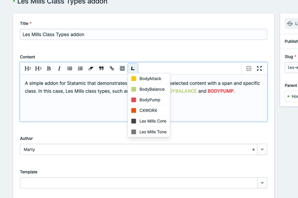
Now we need our menu to include something – in this case, a list of colour-coded Les Mills class names.
1<template> 2 <div> 3 <button 4 class="bard-toolbar-button" 5 :class="{ 'active': showOptions }" 6 v-html="button.html" 7 v-tooltip="button.text" 8 @click="showOptions = !showOptions" 9 ></button>10 <div v-if="showOptions">11 <button v-for="(type, key) in classTypes" @click="setClassType(key)">12 <span class="class-type-mark" :style="'background-color: ' + type.colour"></span>13 <span class="class-type-label">{{ type.name }}</span>14 </button>15 </div>16 </div>17</template>18<script>19export default {20 mixins: [BardToolbarButton],21 computed: {22 classTypes() {23 return {24 'bodyattack': {25 name: 'BodyAttack',26 colour: '#FCC500'27 },28 'bodybalance': {29 name: 'BodyBalance',30 colour: '#b9d47d'31 },32 'bodypump': {33 name: 'BodyPump',34 colour: '#ea4851'35 },36 'cxworx': {37 name: 'CXWORX',38 colour: '#e75204'39 },40 'les-mills-core': {41 name: 'Les Mills Core',42 colour: '#444444'43 },44 'les-mills-tone': {45 name: 'Les Mills Tone',46 colour: '#777777'47 }48 };49 },50 },51 data() {52 return {53 showOptions: false54 };55 },56 methods: {57 setClassType(classTypeKey) {58 // update the editor59 this.editor.commands.lesMillsClassType({60 key: classTypeKey61 })62 63 // hide the menu64 this.showOptions = false;65 }66 }67};68</script>We’ve got a computed list of Class Types, and we’re outputting the each in to a button with the colour.
There’s also a method called setClassType which is calling our lesMillsClassType editor command, and passing the selected key as a parameter. This is what is being passed to our LesMillsClassTypes.js file.
Some styles are also needed here too:
1<style lang="postcss">2.class-type-label {3 @apply block text-left whitespace-nowrap;4}5 6.class-type-mark {7 @apply block w-4 h-4 mr-3 flex-none;8}9</style>You’ll notice I have used Tailwind’s @apply to create actual classes for my addon styles.
The reason here is that if I used inline classes, like in a normal Tailwind project, the CSS of my addon actually overrides (and breaks) Statamic’s layouts.
So by using @apply, I can still keep my Tailwind terminology that I know and love, but also isolate it for use within my Vue component styling.
To help polish the look, I’ve gone through and created a few other classes to style the wrapper, menu and buttons – check out the full source for the completed code – nothing really taxing, but just styles.
And while this is usable… I feel it is missing some decent quality-of-life improvements.
So I’ve also gone ahead and:
added
v-click-outsideif the menu is open, but clicked outsideadded a state to show the currently selected Class Type in the drop down
revised setClassType logic to clear the formatting if text is selected (that is already using a Les Mills Class Type) and the same type is selected
added the “active” state to the button if a Class Type is selected within the Bard editor (like how the “B” is shown as active when you select bolded text)
There’s two key points here.
Firstly, figuring out what the currently selected key is. Remember how we used the BardToolbarButton mixin? Well that gives us access to the editor, which means we can get the Mark attributes and in turn, get the key. So I created this as another computed variable.
1currentKey() {2 return this.editor.getMarkAttrs('lesMillsClassType').key;3}This can be used to update the button’s active state and highlight the active class in the menu.
1<template> 2 <div class="class-type-wrapper"> 3 <button 4 class="bard-toolbar-button" 5 :class="{ 'active': currentKey || showOptions }" 6 v-html="button.html" 7 v-tooltip="button.text" 8 @click="showOptions = !showOptions" 9 ></button>10 <div class="class-type-container" v-if="showOptions" v-click-outside="closeClassTypeMenu">11 <button v-for="(type, key) in classTypes" class="class-type-button" @click="setClassType(key)"12 :class="{ 'active' : key == currentKey }">13 <span class="class-type-mark" :style="'background-color: ' + type.colour"></span>14 <span class="class-type-label">{{ type.name }}</span>15 </button>16 </div>17 </div>18</template>So now the button will be “active” if there is a currentKey, or the menu is open. And in the menu, the class “active” will be added to the current Class Type.
The other big point here is the quality-of-life improvements regarding selection behaviour. I wanted the button to behave in an expected way:
if there is no Class Type, wrap in a span and set the correct Class Type
if there is a Class Type already, and the new selection is different, change the Class Type
if there is a Class Type already selected, and you select the same one again, it removes the styling (i.e. like a toggle)
To achieve this, I’ve updated the command in the LesMillsClassTypes.js file to look at the currently passed attribute:
1commands({type, updateMark, removeMark}) {2 return attrs => {3 if (attrs.key) {4 return updateMark(type, attrs)5 }6 7 return removeMark(type)8 }9}If there is a key attribute, I want to update the mark – otherwise, remove the mark. This means the author doesn’t need to “clear formatting” to remove it. So that’s really neat.
The other change is in the LesMillsClassTypesMenu.vue where I’ve added the logic about de-selecting if the same Class Type is selected:
1setClassType(classTypeKey) {2 // update the editor3 this.editor.commands.lesMillsClassType({4 key: classTypeKey == this.currentKey ? false : classTypeKey5 })6 7 // hide the menu8 this.showOptions = false;9},So if the new classTypeKey is equal to the currentKey, then pass false (which LesMillsClassTypes.js will know to run the removeMark instead of updateMark).
While these may be small in the scheme of things, I feel the quality-of-life additions are what make a good addon. Not just about getting the job done, but presenting expected behaviour for the user.
So what does our final LesMillsClassTypesMenu.vue file look like?
1<template> 2 <div class="class-type-wrapper"> 3 <button 4 class="bard-toolbar-button" 5 :class="{ 'active': currentKey || showOptions }" 6 v-html="button.html" 7 v-tooltip="button.text" 8 @click="showOptions = !showOptions" 9 ></button> 10 <div class="class-type-container" v-if="showOptions" v-click-outside="closeClassTypeMenu"> 11 <button v-for="(type, key) in classTypes" class="class-type-button" @click="setClassType(key)" 12 :class="{ 'active' : key == currentKey }"> 13 <span class="class-type-mark" :style="'background-color: ' + type.colour"></span> 14 <span class="class-type-label">{{ type.name }}</span> 15 </button> 16 </div> 17 </div> 18</template> 19<script> 20import vClickOutside from 'v-click-outside' 21 22export default { 23 directives: { 24 clickOutside: vClickOutside.directive 25 }, 26 mixins: [BardToolbarButton], 27 computed: { 28 classTypes() { 29 return { 30 'bodyattack': { 31 name: 'BodyAttack', 32 colour: '#FCC500' 33 }, 34 'bodybalance': { 35 name: 'BodyBalance', 36 colour: '#b9d47d' 37 }, 38 'bodypump': { 39 name: 'BodyPump', 40 colour: '#ea4851' 41 }, 42 'cxworx': { 43 name: 'CXWORX', 44 colour: '#e75204' 45 }, 46 'les-mills-core': { 47 name: 'Les Mills Core', 48 colour: '#444444' 49 }, 50 'les-mills-tone': { 51 name: 'Les Mills Tone', 52 colour: '#777777' 53 } 54 }; 55 }, 56 currentKey() { 57 return this.editor.getMarkAttrs('lesMillsClassType').key; 58 } 59 }, 60 data() { 61 return { 62 showOptions: false 63 }; 64 }, 65 methods: { 66 closeClassTypeMenu() { 67 // close the menu 68 this.showOptions = false; 69 }, 70 setClassType(classTypeKey) { 71 // update the editor 72 this.editor.commands.lesMillsClassType({ 73 key: classTypeKey == this.currentKey ? false : classTypeKey 74 }) 75 76 // hide the menu 77 this.showOptions = false; 78 }, 79 } 80}; 81</script> 82<style lang="postcss"> 83.class-type-wrapper { 84 @apply inline-block relative; 85} 86 87.class-type-container { 88 @apply absolute bg-white border border-gray-300 rounded-sm z-10 divide-y divide-gray-100 shadow-lg; 89} 90 91.class-type-button { 92 @apply text-left px-3 py-2 w-full hover:bg-gray-100 flex items-center; 93} 94 95.class-type-button.active { 96 @apply bg-gray-200; 97} 98 99.class-type-label {100 @apply block text-left whitespace-nowrap;101}102 103.class-type-mark {104 @apply block w-4 h-4 mr-3 flex-none;105}106</style>Finishing up
Firstly, remove your link you created for your build directory.
And it’s up to you to finish up your project config based on where your addon will live – either installable via composer, or local to your project.
If you’re wanting to install via composer, remove your addon from your project, publish your addon, and then install via composer.
If you’re keeping the addon local to your project, then publish using:
1php please vendor:publish --tag="les-mills-class-types"And you now have a working addon for Bard.
If you are looking for the full source code, check out the martyfriedel/les-mills-class-types repo on Github.
This was a real deep-dive for me in to the workings of Bard buttons and commands – and the best spot to look is the Statamic source.